It's Warming Up on the Flowery Coast
You too can check that global warming isn't one big hoax by looking at the data near you:
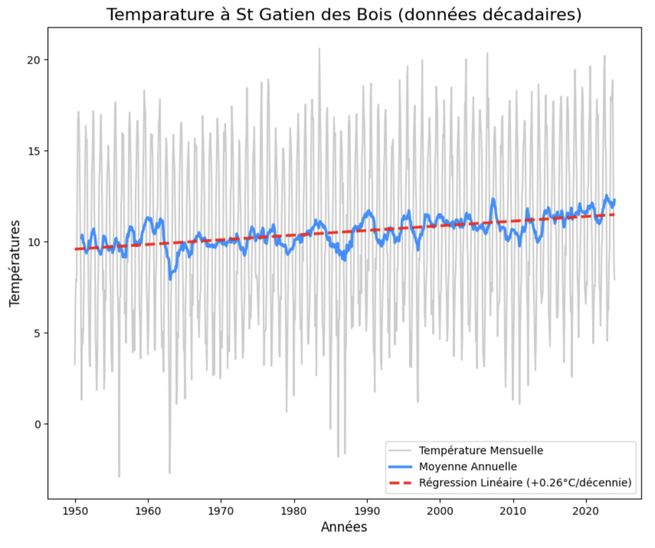
Global warming in Trouville-Deauville
A chart I made as an exercise to learn the Pandas library (for processing data) in Python (a programming language), using Météo-France's ten-day temperature data for Saint-Arnoult.
You can clearly see the quarter-degree-per-century rise climatologists talk about.
I had already posted it on social media, but now that I can publish longer notes, I'm sharing the code below. If you want to check in your area too, here's how:
The steps are as follows:
- If you don't have Python, install it.
- Use Pip to download the Pandas (data), Matplotlib (charts), Seaborn (even prettier charts) and Scipy libraries.
- Go download the ten-day data from Météo-France.
- The Python code:
    # Importing necessary libraries
    import pandas as pd
    import matplotlib.pyplot as plt
    import seaborn as sns
    from scipy.stats import linregress

    # Reading the CSV file of ten-day data
    csv_file = "DECADQ_14_previous-1950-2023.csv.gz"
    df = pd.read_csv(csv_file, sep=";")

    # Converting the date column to datetime format
    df['AAAAMM'] = pd.to_datetime(df['AAAAMM'], format='%Y%m')

    # Filtering data for Saint-Gatien-des-Bois station
    df_sg = df.loc[df['NOM_USUEL'] == 'ST GATIEN DES B', ['AAAAMM', 'TM']]

    # Calculating monthly average temperatures
    df_sg_mensuel = df_sg.groupby(df_sg['AAAAMM']).mean()
    df_sg_mensuel.head()

    # Calculating 12-month rolling average (annual average)
    df_sg_mensuel['TM_MEAN'] = df_sg_mensuel['TM'].rolling(window=12).mean()
    # Preparing data for linear regression
    x_numeric = (df_sg_mensuel.index - df_sg_mensuel.index[0]).days / 365.25
    y_values = df_sg_mensuel['TM']

    # Calculating linear regression to identify the trend
    slope, intercept, r_value, p_value, std_err = linregress(x_numeric, y_values)
    df_sg_mensuel['TM_TENDANCE'] = (slope * x_numeric) + intercept

    # Creating the chart
    plt.figure(figsize=(10, 8))

    # Plotting monthly temperature (in light gray)
    sns.lineplot(x=df_sg_mensuel.index, y=df_sg_mensuel['TM'],
    label='Monthly Temperature', color="grey", alpha=0.4)

    # Plotting annual average (blue curve)
    sns.lineplot(x=df_sg_mensuel.index, y=df_sg_mensuel['TM_MEAN'],
    label='Annual Average', color='dodgerblue', linewidth=2.5)

    # Plotting warming trend (red dashed line)
    sns.lineplot(x=df_sg_mensuel.index, y=df_sg_mensuel['TM_TENDANCE'],
    label=f'Linear Regression (+{slope*10:.2f}°C/decade)',
    color='red', linestyle='--', linewidth=2.5)

    # Customizing the chart
    plt.title('Temperature at St Gatien des Bois (ten-day data)', fontsize=16)
    plt.xlabel('Years', fontsize=12)
    plt.ylabel('Temperature (°C)', fontsize=12)
    plt.grid(False)
    plt.show()
After the nasty feedback from my climate video, it doesn't hurt to double down.