You too can verify that climate warming isn't some big joke by looking near your home:
Image
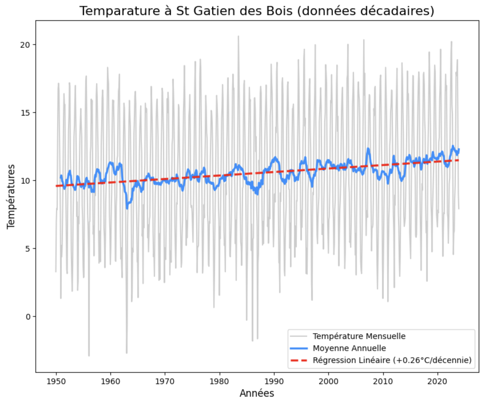
A chart I produced as an exercise to learn how to use the Pandas library (for data processing) in Python (a programming language) from Météo-France's ten-day temperature data at Saint-Arnoult.
You can clearly see the quarter-degree per century increase that climatologists tell us about.
I had already posted it on social media, but I'm taking advantage of being able to publish longer notes to share the code below. If you want to check in your area too, here's how:
– LA SUITE –
The steps are as follows:
- If you don't have Python, install it.
- Use Pip to download the Pandas (data), Matplotlib (charts), Seaborn (even prettier charts) and Scipy libraries.
- Go download the ten-day data from Météo-France.
- The Python code:
    # Importing necessary libraries
    import pandas as pd
    import matplotlib.pyplot as plt
    import seaborn as sns
    from scipy.stats import linregress

    # Reading the CSV file of ten-day data
    csv_file = "DECADQ_14_previous-1950-2023.csv.gz"
    df = pd.read_csv(csv_file, sep=";")

    # Converting the date column to datetime format
    df['AAAAMM'] = pd.to_datetime(df['AAAAMM'], format='%Y%m')

    # Filtering data for Saint-Gatien-des-Bois station
    df_sg = df.loc[df['NOM_USUEL'] == 'ST GATIEN DES B', ['AAAAMM', 'TM']]

    # Calculating monthly average temperatures
    df_sg_mensuel = df_sg.groupby(df_sg['AAAAMM']).mean()
    df_sg_mensuel.head()

    # Calculating 12-month rolling average (annual average)
    df_sg_mensuel['TM_MEAN'] = df_sg_mensuel['TM'].rolling(window=12).mean()
    # Preparing data for linear regression
    x_numeric = (df_sg_mensuel.index - df_sg_mensuel.index[0]).days / 365.25
    y_values = df_sg_mensuel['TM']

    # Calculating linear regression to identify the trend
    slope, intercept, r_value, p_value, std_err = linregress(x_numeric, y_values)
    df_sg_mensuel['TM_TENDANCE'] = (slope * x_numeric) + intercept

    # Creating the chart
    plt.figure(figsize=(10, 8))

    # Plotting monthly temperature (in light gray)
    sns.lineplot(x=df_sg_mensuel.index, y=df_sg_mensuel['TM'],
    label='Monthly Temperature', color="grey", alpha=0.4)

    # Plotting annual average (blue curve)
    sns.lineplot(x=df_sg_mensuel.index, y=df_sg_mensuel['TM_MEAN'],
    label='Annual Average', color='dodgerblue', linewidth=2.5)

    # Plotting warming trend (red dashed line)
    sns.lineplot(x=df_sg_mensuel.index, y=df_sg_mensuel['TM_TENDANCE'],
    label=f'Linear Regression (+{slope*10:.2f}°C/decade)',
    color='red', linestyle='--', linewidth=2.5)

    # Customizing the chart
    plt.title('Temperature at St Gatien des Bois (ten-day data)', fontsize=16)
    plt.xlabel('Years', fontsize=12)
    plt.ylabel('Temperature (°C)', fontsize=12)
    plt.grid(False)
    plt.show()
After the nasty feedback from my climate video, it's good to double down on it.